Published 2026-07-28
Why phonics colour-coding is not universal — and what that means for your artwork
A magnetic letter set that sells well in the US can confuse a UK classroom, because the colour systems teach different things. If you are sourcing phonics products, the colour scheme is a market decision, not a design preference.
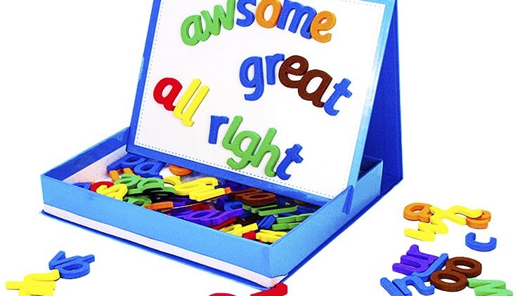
Phonics colour-coding schemes differ by market and by programme. The most common convention distinguishes consonants from vowels by colour, but structured-literacy programmes extend that to digraphs, trigraphs, R-controlled vowels and vowel teams — and the specific colours differ between publishers. Artwork should be matched to the scheme taught in the destination market rather than reused globally.
What the colours are doing
In a well-designed phonics manipulative, colour is not decoration. It is carrying instructional information: this group of letters behaves as one sound, this vowel is controlled by the R that follows it, this pair is a digraph rather than two separate sounds.
The simplest and most portable convention is consonants in one colour and vowels in another. It travels well because almost every programme agrees on it, and it lets a child see at a glance why every word needs a vowel.
Where the schemes diverge
Above that baseline, systems part company. Structured literacy programmes in the US typically colour-code by phoneme category — consonant digraphs, vowel digraphs, glued sounds, R-controlled vowels, vowel teams, prefixes and suffixes each get their own treatment. UK synthetic phonics programmes group by teaching phase instead, so the same letter pair may sit in a different colour because it is taught at a different point.
Neither is wrong. But a set printed for one and shipped to the other is actively unhelpful, because a teacher has to explain that the colours do not mean what the children have been taught they mean.
The practical consequence for sourcing
Treat the colour scheme as a market specification, alongside language and packaging. In practice that means:
- Decide the destination market before artwork, not after.
- If you sell into more than one market, expect more than one artwork version — the tooling and the foam die stay the same, so the incremental cost is print, not moulds.
- If you are supplying schools that follow a named programme, ask them for the scheme rather than guessing from a competitor's product.
- Keep the physical set identical across versions so component counts, cartons and shipping stay simple.
What can change without new tooling
This is the useful part. On EVA foam tile sets, the die that cuts the letter shapes is separate from the printing. Changing the colour system, adding a market's specific digraph set, or reordering how tiles are grouped in the storage box are all print and packing changes — they do not require a new cutting die.
So a buyer selling into three markets can usually run one tooling investment and three artwork versions, rather than three separate products. That is worth planning for at the first order rather than discovering at the third.
A note on ESL
Sets sold for English as a second language have a different problem again: the learner may have no prior expectation of what the colours mean, but the teacher usually does. Where a set is going into ESL use across several countries, the safest choice is the plain consonant/vowel distinction, with digraph groupings shown by physical tile shape rather than colour.